In February 2020, Aegean Airlines proudly launched its new aircraft livery and new logo, designed to convey an image stressing the culture of the airline. The new logo, resembling two gulls, will increasingly be seen on the tail of its aircraft – if the airline survives.
In the year-long transformation project, Aegean probably paid a king’s ransom to London-based design consultantancy, PriestmanGoode.
Now, as we all know, Aegean has fallen upon hard times. Maybe PriestmanGoode can help it out and give Aegean a cash refund, or, allow it to defer payment of its bill for 18 months ?!
In the meantime, so as not to disappoint its customers (who were clearly sick to the eye-teeth of their old logo ??? ?), I can step forward and offer Aegean a design of my own at a bargain price – not a king’s ransom but A. King’s refund ?!
In the YouTube video below, Aegean tells us about the design concepts of its new logo – “symmetry, balance, harmony – inspired by the seas – inspired by the skies”.
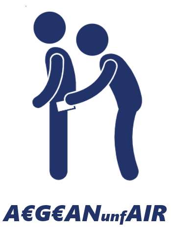
Well – time moves on and Aegean now has a brand-new image in the eyes of a great many of its passengers – its new logo is already defunct. My logo encompasses Aegean’s new image and culture – stealth, dishonesty, conflict – inspired by theft – inspired by other people’s money.
The logo resembles two figures – one an unsuspecting traveller, the other a devious pick-pocket. Sound familiar?

 Leave a comment about this comment